Please see me my other Excel articles.
Histogram: Comparing Distributions with Relative Frequency
In my Histogram article I introduce a different version of the bar chart where instead of simply displaying ranges of values in each bar, you can display groups or categories of values (age groups and their diagnosis rates).
In this article I will demonstrate how you can create the same histogram, but instead of simply displaying a measure (x-axis) for values, you can display each value’s relative frequency when compared with the total of the data set.
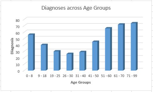
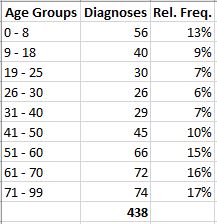
As you can see, the range of diagnosis values is indicated by the a-xis with the categories or Age Groups indicated along the y-axis.
While seeing the each age group’s range of values is helpful, I would like to understand each range of values when compared to the data set’s total value.
First, I’ll add a new column to my data set where for each value, I’ll compare with it with the total of all values. Note: In my forumla I used the ‘$’ character to fix the range used for so as I copy the formula to other cells, the same range is used.

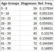
With each diagnosis value having its relative frequency, I’ll update the cells’ format to use a percentage format.
The Relative Frequency column now displays the percentage of each diagnosis when compared to the total.