Please see me my other Excel articles.
Histogram: Quickly Illustrate Relative Frequency
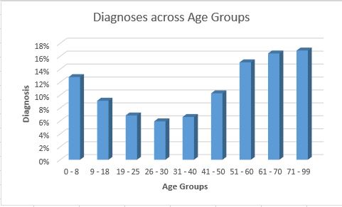
In my Relative Frequency Histogram article I demonstrated how to transform a histogram to show each category’s value in comparison to the grand total of all diagnosis.
In this article, I will show how to begin with a relative frequency histogram and replace the bars with a simple line, showing only the maximum value for each category.
By selecting my existing chart, I can change the current chart type from showing bars for the frequency histogram to showing only a line, touching the greatest value for each bar.


With this frequency polygon histogram, I can more quickly visualize the curve of the relative frequency values without requiring the full range of values of bars in a usual histogram.
