Please see me my other Excel articles.
Histogram: Comparing Distributions
Comparing distributions against each other using a value list yields rich insight.
In this article I will describe how to use a column chart to compare data from a cancer study.
I’ll begin with a data set which describes age groups and frequency of cancer diagnoses.
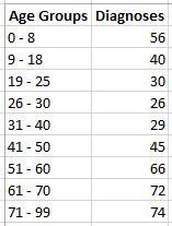
This data set reveals a spike of cancer rates among the youngest in the sample, which subside as the age groups increase, then spike again during the older years.
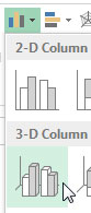
First, I’ll highlight both columns of data and from the Insert menu, click the Column icon, then the column chart I want.
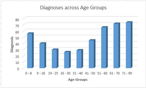
This chart utilizes columns to reveal more intuitively what I stated earlier about the data set – that a trend exists between higher cancer rates and the youngest and oldest age ranges.
