Please see me my other Excel articles.
Bubble: Comparing Data Correlations and Variances
Similar to XY Scatter Plot charts (above) where you compare correlations between data, you may elect to use a bubble chart to additionally view data variances.
Beginning with the same data set for XY Scatter Plot charts example, I added some data to indicate significantly more data points within the 3 hours of study resulting in a grade average of 3.0 or greater.
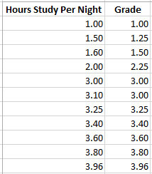
Using the same steps as before to highlight the data set and select a chart, I elect to use the Bubble chart instead.

Once the chart appears, I customized the bubble size so clusters of data points were more clear.
As you can see, the greatest concentration of results appear between the vector of 3 hours of study and grade average of 3.0. Also the greatest variance of values appears between those two results meaning more students reported those hours of study with similar results when compare to 1 or 2 hours of study and lower grade averages.

