Please see me my other Excel articles.
Bar Chart: Comparing Distributions Vertically
Sometimes when using a bar chart, you may find with too many categories, it is not feasible to display all the bars horizontally. In such cases, simply displaying bars vertically allows for many more categories to be compared within a chart. In this article I will demonstrate how to create a vertical bar chart.
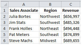
First, I’ll begin with a set of test data reflecting sales revenue according to regions.
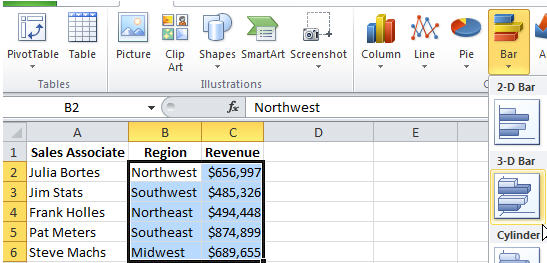
To create a chart, first I’ll select the range of values to be used by Axis. Then using the Ribbon bar, I’ll select to Insert a new chart.
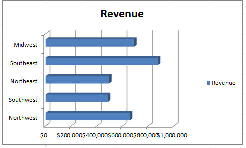
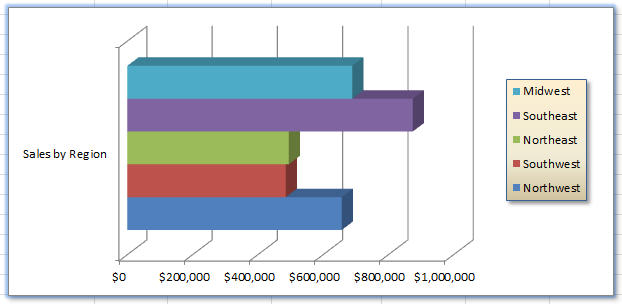
As you can see, we now have a chart with the regions on the Y-axis and the values on the X-axis.
However, with all bars the same color and the generic “Revenue” labels, it’s not as intuitive as it should be.
First, I will right-click the chart and choose “Select Data.”
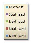
Then, I’ll click “Switch Row/Column” to the Region names are on the right. Also, it automatically color-coded the regions and matching legend.
I still don’t like the name, so I’ll rename it to “Sales by Region” by renaming the source column header.
Now the only problem is the scrunched sales figures so I’ll select the chart and using the side-handles, I’ll drag it wider so that all values have room without overlapping.
To format the legend displaying Region names, I right-click it and select Format Legend where I will apply a fill and border colors.
Now, I’ll do the same to the chart.