Please see me my other Excel articles.
Stacked Column Chart: Comparing Distributions and Their Ranges
Similar to the Bar Chart, chart allows you to compare categories, but also ranges of values within each category.
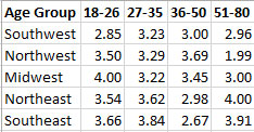
In this example, I’ll begin with a data set consisting of adult-student grade averages listed by age group and US regions.
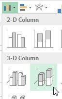
Next, I’ll highlight the data and use the Insert menu to add a Stacked Bar chart.
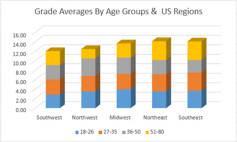
As you can see, the US region which reports the highest grades across all age groups is the Northeast with the Southwest reporting the lowest.
The same region reports the highest grades from the highest age group (51-80) with the Northwest reporting the lowest grades for the same age group.
Also, it appears the lowest two age groups report similar grades across all regions with the age groups of 36 – 50 and 51 – 80 showing the greatest diversity in grades.
