Please see me my other Excel articles.
Use a Bar Chart to Communicate Important Trends
In this article I will highlight important considerations when designing a bar chart to ensure its ability to intuitively illustrate patterns within data.
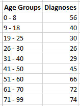
First, I’ll begin with a simple data set of disease diagnoses for age groups beginning with new born children up to those of 99 years.
The data set contains different age groups as the primary identifier for each row and Diagnoses as its only variable.
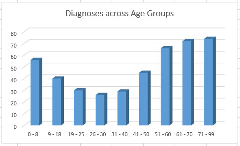
After building a simple bar chart, its clear diagnoses are higher earlier in life for this particular disease than during the patients’ middle ages, then spike and continue that trend until death.
Chart Title
First, present the user a brief description for the purpose of the chart at the top, above trend display. In this case the title “Diagnoses across Age Groups” quickly communicates to the user the chart’s purpose.
Axes
Ensure the x-axis (horizontal) displays the primary identifiers (Age Groups) from the data set and all values for the variable Diagnoses fit within one of the age groups.
Next, provide the user with a standard to measure the values for each bar for each age group.
In this example the first age group is 0-8, but the user won’t understand the significance of that bar unless they can visually compare it to the measurement scale to its left to see the bar’s highest value resides between 50 and 60.
Data Labels
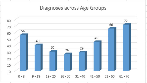
For further clarification you may also denote each bar’s highest value by assigning a label at the top of each bar.
Bar Display Order
In this study the order of the age groups is more important than displaying bars in the order according to their value, but you may choose to do so where it is important for the user to quickly discern highest values.
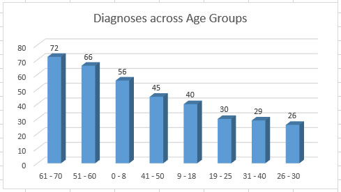
This display quickly communicates the highest diagnoses fall within the two oldest age groups, with the third being the youngest age group.
