Please see me my other Excel articles.
Clustered Column Chart: Comparing Categories & Sub Categories
Similar to bar chart previous described, this chart type provides an intuitive way to describe categories with the addition of sub categories as well.
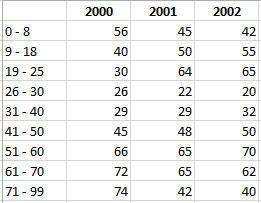
In this example, I will use this chart type to visually-describe a multiyear medical study of cancer treatment diagnoses between different age groups. The age groups represent the categories and years the sub categories.
First, I’ll begin with my data set arranged so that each age group is listed along with its diagnoses under each year.
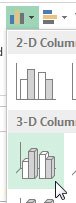
Next, I’ll highlight the data and use the Insert Menu to select the Clustered Column chart.
After updating my title, I have my data set visually representing each age group’s cancer diagnoses for each year.
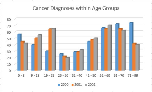
Generally speaking, it appears for most age groups the number of diagnoses increases from year-to-year with the exception of the youngest and oldest age group showing a steep decline.
