Please see me my other Excel articles.
Line Chart: Displaying Trends Over Time
Often in statistical studies the organization requires the ability to discern patterns within trends which spans dates.
The Line Chart represents one of the best methods to display trends of time.
In this article I will demonstrate how to display the effect a student’s study habits have on their resulting grades.
First, I’ll begin with an Excel table representing the number of hours a student spent studying every night along with the resulting grade of the next morning’s quiz.
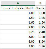
As you can see, a correlation exists between the student slowly increasing their hours of study and their resulting grades.
However, the line chart presents a more intuitive method to convey the same results.
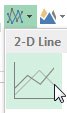
I’ll highlight both columns of data, then from the main menu choose Insert, then the Line icon.
Excel automatically creates a line chart showing a correlation between the hours which a student increases their study time and their grades.
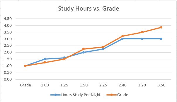
As the student begins, you see their grade falls slightly below the number of hours they studied the night prior.
However, at 1.5 hours through the end of the study the student’s grades consistently increase with the most notable jump after 3 hours of night study.
It seems once the student has established consistent study habits, their grades will continue to improve without needing any more hours of study.
