Please see me my other Excel articles.
Using an Ogive to Communicate Accumulated Growth over Time
In my line chart article I demonstrated how to create a line chart, or ogive, which is similar to a bar chart in that a trend over time is displayed, but an ogive only displays the greatest value for each variable, instead of a bar for all values. Also, each greatest value is connected by a line where in a bar chart the bars are not.
In this example, I will demonstrate how to use an ogive to communicate growth of a home’s value over time.
First, I’ll begin with this simple data set.
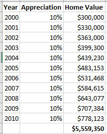
From this data I’ll create a simple ogive using the year and appreciation percentage.
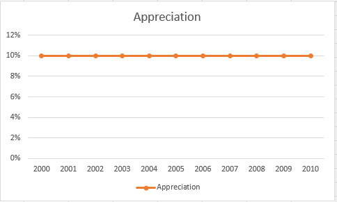
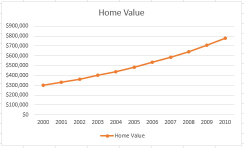
While this chart is accurate in that it displays the consistent annual appreciation of 10%, what I really need to see is how the home’s value grows over time.
I edited the previous chart to select a new data range, selected Home Value instead of Appreciation and now I have the desired chart, one which shows the growth of the home over a period of ten years.