Using Colors to Emphasize Trends
In my previous Tableau: Calculated Field post, I illustrated how to create a new calculated field using two existing fields to call attention to a trend in the data.
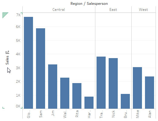
However, as you can see, the columns all share the same color and while the Salesperson with the highest sales per region is evident by the column size, using different colors to indicate the difference would be more intuitive to the user.
Tableau allows you to drag dimensions and measures onto the Color button to apply different colors.
First, I will drag the Salesperson dimension onto the Color button.
You may also drag fields from the Columns and Rows areas using the [Ctrl] + [Field] combination.
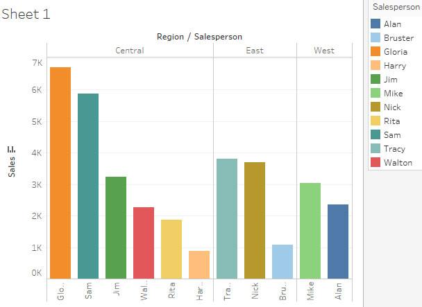
Now, all my Salespersons have a unique color and a new legend explains the colors.
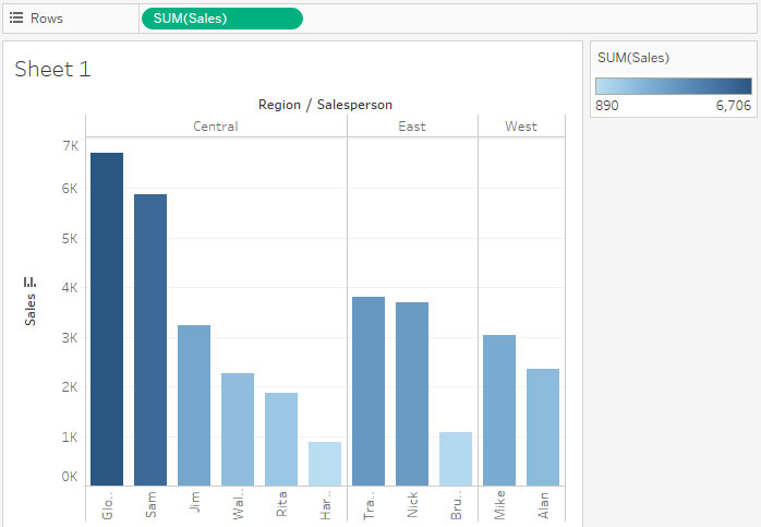
However, I would like to return to the original where a similar color is used between values, but the greatest value is evident. Therefore, I will drag the SUM(Sales) Row onto Color.
While is more my goal, each region needs a unique color so I will drag Region from Columns onto Color.
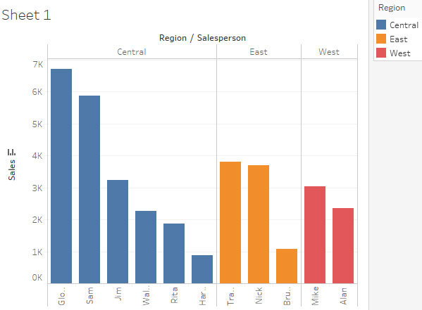
Now, each region utilizes a unique color and its clear which Salesperson has the greatest amount in Sales.

Pingback: Tableau: Formatting With Labels | TechMbaBi