Using Data Indicators to Emphasize Trends
In my previous Tableau: Styling With Colors post, I illustrated how to use colors to visually illustrate trends in data by displaying all bars within a region by Salesperson using the same color.

However, in that example, when using that chart in a report distributing in a presentation or document, the individual bars lack clear values.
In this article I will begin with a new dataset of students’ grades to show how you can apply labels within the chart using actual values to indicate to the user each bar’s place relative to the y-axis.
Also, I will show how to consistently display values throughout the entire chart and its axes.

Like my other [Tableau articles], I’ve loaded my dataset and formatted the students’ grade by classes, with each class using a unique color. Also, within each class I sorted the grades by the highest grade first.
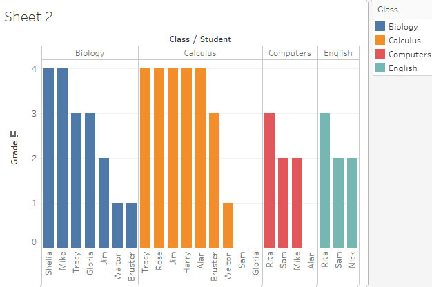
As you can see, determining those with the highest and lowest grades is clear, but not the actual values for each bar.
Also, the chart can benefit from more consistency in its display.
First, I’ll display each bar’s value by dragging ([Ctrl] + click) SUM(Grade) from Rows onto the Label button. Then, I’ll right-click SUM(Grade), select the Pane tab, and change the Numbers format to include decimal places. Also, I’ll set Alignment to Horizontal.
Now, I’ll address the axes format to make the overall display more intuitive by right-clicking each axis and choosing the Axis pane.
First, I’ll remove the unnecessary chart header – “Class/Student.”
For the y-axis I’ll change the values to include decimal places.
On the x-axis, I’ll change the alignment for students to vertical.
For both axes, I’ll increase the font size, use BOLD style.

Now I have a chart displaying students’ grades for each class, each grade value is displayed, and within each class, the highest grade is obvious.
