Using Geographic Data to Display Trends on Maps
Tableau illustrates its powerful mapping capabilities when data contains geographic data.
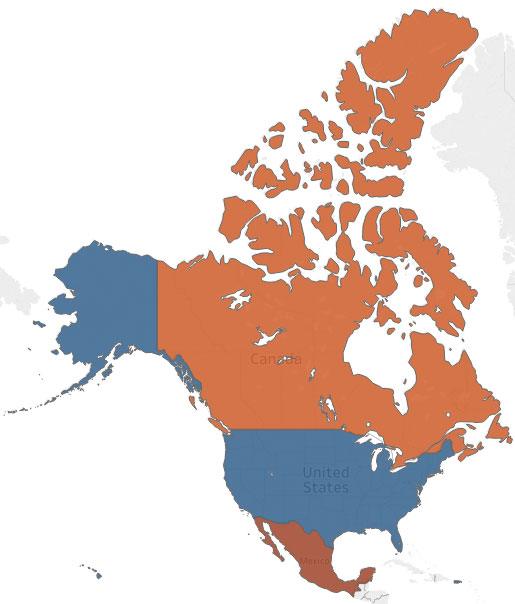
In this article, I will begin with a simple dataset of customers who resides in Canada, the US, and Mexico.

Upon loading my file, I’m presented with the following dimensions and measures.
As you can see, the Country dimension is treated like a geographic data type so Tableau created latitude and longitude measures.
If you are missing these measures, ensure the Country is not treated as a string data type or right-click it and update its data type.

Upon dragging the Number of Records measure onto Colors, all three countries are shaded according to the number of customers they contain and I’m provided with a helpful legend.

While this is helpful, without numeric values, it’s not clear how many customers reside within each country so I will drag the same measure onto Labels.
After updating the labels to use a larger font size and BOLD, I now have an intuitive display of each country’s customer size.


Pingback: Statistical Analysis | TechMbaBi