Please see my other Statistics articles.
Delivering Multidimensional Understanding
In this article I will demonstrate how to use a data set to communicate joint (or two) distributions of data.

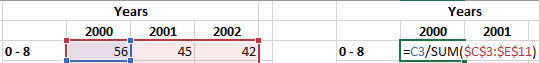
First, I will convert the table into a relative cumulative table, beginning with the first age group (0-8).
In this formula, I’m instructing Excel to divide the first diagnosis number (56) to produce a percentage. Note my use of the ‘$’ character in the formula to ensure when I duplicate the formula to other cells, the same range of values are used.
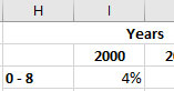
Now that I have the first percentage for the age group 0-8 for the year 2000, I’ll duplicate the formula to the adjacent cells, then create a row total.
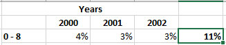
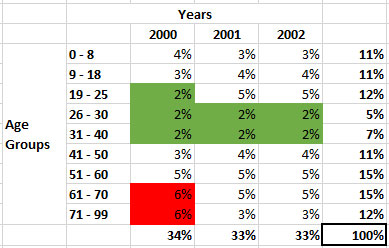
Next, I’ll duplicate the formula to other age groups’ rows, then create their totals. Finally, I’ll produce a total for each column. Notice how each column totals summed equal 100% as well as each row totals.

With both (joint) distributions (Age Groups and Years), I can now easily see the highest percentage of disease diagnoses occurred for the two oldest age groups, in the year 2000, and the least percentage of diagnoses occurred for all three years between age groups of 26-30 and 31-40, with the age group of 19-25 only in the year 2000.