Please see me my other Excel articles.
XY Scatter Plot: Comparing Data Correlations
Unlike other charts where data points form a contiguous shape whether in bars (bar chart) or slices (pie chart), scatter plot charts display distributions with individual data points, reflecting correlations between values. The name of this type of type begins with “XY” because the data points reflect positions on both axes.
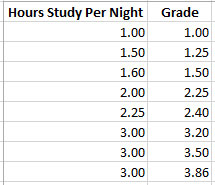
In this example, I’ll begin with a data set containing the number of hours a student spends studying a night along with the resulting grade.
 Next, I’ll highlight the data and use the Insert menu to add an XY Scatter Plot chart.
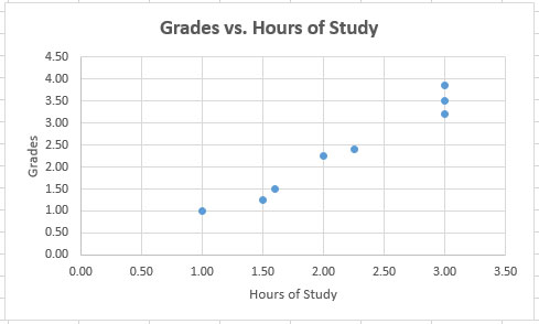
Once the chart appears I’ll customize it by adding axes titles to distinguish the purpose of each set of axis values.
As you can see, the dots clearly indicate the more time a student spends studying each night, the greater their increase in grades, with 3 hours representing the greatest increase in scores from 2 hours per night.