Please see my other Statistics articles.
Ensuring Tables Intuitively Communicate Data
During most data analysis, team members must review many small to large data sets.
Often, these data sets resides within poorly designed tables, wasting much time when they should have first re-designed those tables to make the data more intuitive and easier to discern patterns.
In this article, I will demonstrate some principles to quickly and easily design intuitive data tables.
I’ll begin with a simple table containing users with a few generic fields.

As you can see with this simple table which contains one quantitative field (id) which is a primary identifiers (unique to each row) containing twenty values (only 10 shown here) and four categorical variables (first_name – ip_adress), the table is easy to understand. The table is intuitive because it follows some very simple rules for table design.
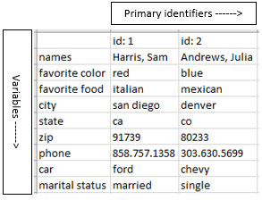
Primary Identifiers vs. Variables
In the example above, there are twenty primary identifiers (id values) and only four variables, meaning more primary identifiers exist than variables.
To display data intuitively, reserve the leftmost column to display primary identifiers top-down area and use the header area across the top for the other (variables).

Conversely, when more variables exists than primary identifiers, display variables down the left side and primary identifiers across the top.
In this example, only primary identifiers exist (id: 1, id: 2), but nine variables exists so they are displayed down the left side.