Using Tableau to A/B Test Whether Using Tutors Produces Higher Grades
In this article, I will demonstrate how to use Tableau to determine if a relationship exists between students’ grades and whether they used a tutor during their study time using the statistical process A/B Test.
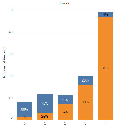
I’ll begin with a simple dataset of 100 students, their info, grades, and a flag determining whether or not they used a tutor when studying.

Since the most important outcome is the students’ grades, I’ll add that dimension to the Columns.
Within each of the possible grade values (0 – 4) I want to see how the portion of each grade was the result of a tutor, I’ll add that dimension onto the Color button.
Now, to add data to populate the four columns, I’ll drag the Number of Records measure onto the rows.
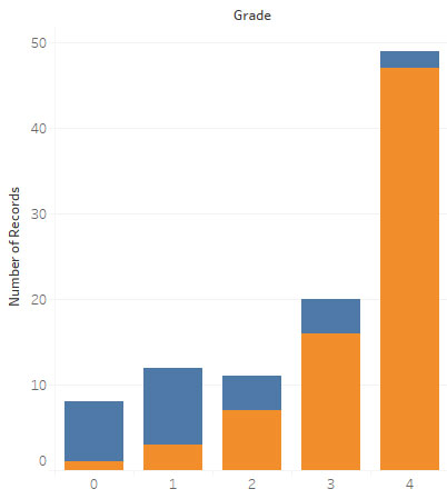
Also, I have a legend to explain the values.

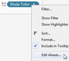
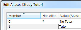
Now I’m going to make the legend more intuitive by replacing numbers with values to distinguish students who used a tutor from those who didn’t by adding aliases for the legend values.
Now my legend is more intuitive.

Thought it’s clear students which used a tutor consistently achieved higher grades, I will quantify the columns by adding the Number of Records onto the Label.

Now, I can see actual numbers for students who did and didn’t use a tutor along with the grades.
However, instead of numbers, I would like to see percentages.
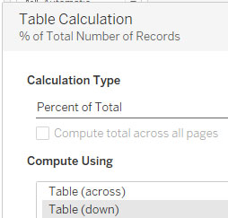
First, I’ll right-click Number of Records on the Marks pane and add a Table Calculation.
I’ll select a Percent of Total (the entire table) and Table (down) so the percentage is a calculation of the total is it goes down the column.
Now I need to update my y-axis to also use a percentage.
I’ll [Ctrl] + click the Number of Records on the Marks pane and drag it onto (replace) the Rows value.
Next, I’ll add aliases to the Grade column to replace number grades with letter grades.

Now I wish to see the tutor label in the columns so I’ll drag it onto Label.
Then, I’ll reorder the values in the Marks pane to the tutor aliases added previously display above each percentage.
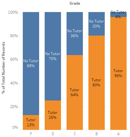
Finally, I wish to add a reference line to distinguish the average rate at which a tutor was used for all grades (74%) that displays through all grades. This serves as a helpful reference when interpreting each grade’s tutor use.
I’ll do this by right-clicking the y-axis and select to add a Reference line.
Then, I’ll update the line’s properties, including where on the axis I wish it to display.


With my chart completed, I can determine the following.
As the percentage of tutor use increases, so do the students’ grades – the orange area of the three highest grades (C – A) reflect this reality. Conversely, the largest blue areas (“No Tutor”) constitute most of the two lowest grades’ columns.

Pingback: Statistical Analysis | TechMbaBi
Pingback: Tableau – Comparing Worksheets | TechMbaBi
Pingback: Statistics: Use Bins to Clarify Distributions | TechMbaBi