Visually Illustrating Relationships
Venn Diagrams provide a very intuitive method for communicating relationships among categories in data.
In this article I will demonstrate how to use a Venn diagram to illustrate an intersection of categories.
I will begin with a simple data set consisting of simple survey results of respondents asked which luxury automobiles they would like to purchase.
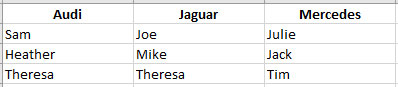
As you can see, one person (Theresa) chose both Audi and Jaguar. All other respondents only selection on make of car.
Though this data set is simple enough to visually inspect for those who selected more than one choice (intersection), I create a new table which displays their Auto Preferences more clearly so its easier to distinguish where an intersection occurs.
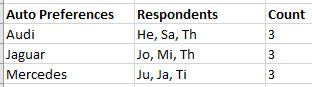
Now, I can more quickly see the abbreviate “Th” in two categories.
Creating a Venn Diagram
Now that my data set is ready to use in creating the diagram, I will use a free Venn Diagram Maker.
https://www.meta-chart.com/venn
On the Data tab, I will enter data from my new table above.
Note that I entered an intersection (where at least one person selected both categories) of ‘1’ between Audio and Juguar. No other intersection between categories exist.

When I click the Display tab, I am presented with an intuitive set of circles, each representing a category of auto maker from the data set.

The first circle is separate, indicating no people who chose Mercedes also chose either of the other two automakers – Audi and Jaguar.
If desired, I may mouse-over either circle to see the number of choices for that category.

You’ll notice however the Audi and Jaguar circles overlap, indicates at least one user who select one choice also selected the other.
The overlapping portion of each circle indicates an intersection – user(s) who selected both auto makers.

