Table features: Conditional-Formatting, Filters, and Charts.
In this article, I’ll illustrate powerful Excel features provided with tables such as: Conditional-Formatting, Filters, and Charts.
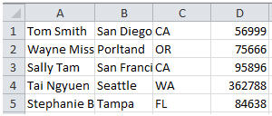
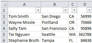
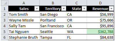
First, I’ll begin with a simple data set.
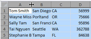
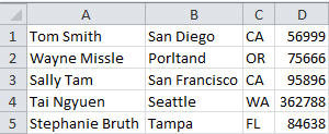
You’ll notice some of the values are truncated, so I’ll click the top-left cell to select all cells, then double-click the dividing line between any two column headers. Now, each column’s value has enough space.
Now I’ll insert a filter for each column so that I may show/hide desired values from each list. I’ll begin by inserting a new first row that will serve as each column filter’s name. Next, I’ll select each column header, effectively selecting all rows in each column. Then, I’ll select from the Menu toolbar, Sort & Filter/Filter. This applies a filter selection for each column. I’ll then assign a name to each filter to distinguish the column filters.
With filters applied, I can specify which rows I want displayed.
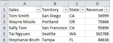
I’d like the table to be easier to read so I’ll reselect the columns and from the Menu, select “Format as Table” to automatically apply an attractive format to the table.
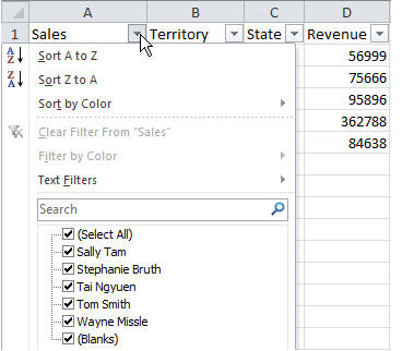
With the filters applied and new formatting, I can now make effective use of this table using partial filter capability – entering only a portion of the desired search to display matching records.
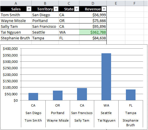
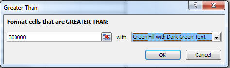
Now I wish to have Revenue values over $300k stand out so I’ll highlight all the values and select Conditional Formatting.
I’d like to visually compare sales revenue by region so I’ll select all the values, then from the Menu, Insert/Column, and select the desired type.