Denoting data trends by applying logic-controlled formatting, for example, employees with the most amount of accumulated Sick Leave.
To illustrate how to apply specifying formatting based on values, I’ll begin with a dataset that returns employee data.
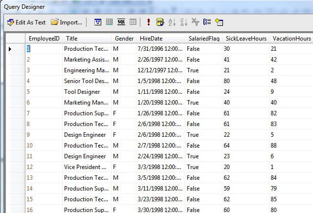
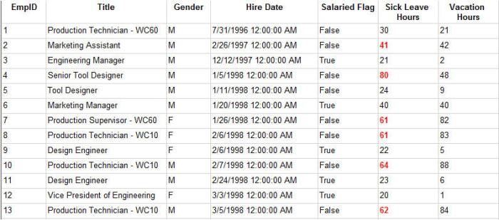
By viewing the resultset, it’s difficult to discern any distinguishable trends in the data.
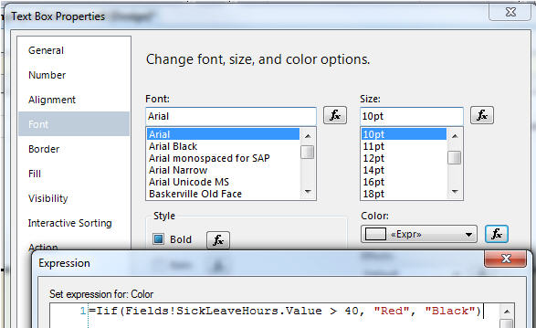
To denote those employees with over 40 hours of sick leave, I’ll assign a test for the field’s Font color property that will use a red color is Sick Leave is over 40 or it will remain black.
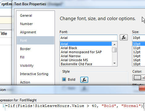
For the Font Weight property, I’ll assign a similar function that will make the same text bold or leave it normal.
By executing the report, I can now more easily tell which employees have over 40 hours of sick leave because their hours are red and bold.
(right-click, Save As)
